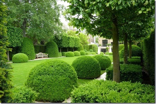
This year’s Telegraph garden is designed by Tommaso del Buono and Paul Gazerwitz and is supposed to be Italian inspired, with a modern twist. This is the first time I have seen the proposed plan and to be honest, I am a little disappointed.
Click Here to see the Telegraph Article
Why? ……Because I have been looking forward to seeing their entry, especially after seeing the beautiful examples of their work on their website http://delbuono-gazerwitz.co.uk/
They appear to have 2 distinct, almost opposing styles of design. The first ‘contemporary classical’ using a formal axial design and the second heavily plant based, using herbaceous perennials interspersed with topiary. I particularly liked the clean simple lines of their gardens and particularly liked the their “Topiary no flowers approach to gardening” which relies more on light and shadow, form and shape to provide the visual interest.
Their other style, relies heavily on planting and while nice, can be seen in many other designers portfolios.
What concerns me about their Chelsea exhibit, is that it appears to be a pastiche of both style -neither one thing or the other. I would surmise that being a design partnership, Buono favours the contemporary classic and Gazerwitz the horticultural fluff. But not having met them, I can only speculate that the coming together to create this exhibit, has been an uneasy compromise of both designer’s work.
The plan is based on a simple grid system and designed to be viewed from both the side and the front, although the front view is likely to give the best overall impression of the garden. In the Telegraph article they describe the garden
“as to adhere to the guiding principles of Italian horticultural tradition, but with a modern slant, and will be refreshingly simple in nature.”
If I squint, I can just about see the Italian influence, but could “refreshingly simple” be another description for dull?
A central formal lawn (seen in so many Chelsea gardens in the past) is bordered by a stone path (or is that a simply a mowing edge, dependent on the vigour of the topiary?) The flower borders are minimal in width and they will struggle to create anything crowd pleasing in those.
The one unknown in all this is the topiary at both ends. If they can find trees of a sufficient size and maturity to create the canopy roof they talk about, then they may just pull it off.
Having said this, I am unconvinced by the way the tree trucks interfere with the usable space on the rear terrace, rendering it useless as a dinning space and only fit for a few chairs.
While critiquing a garden from plan is very difficult, the technical execution of its building will be paramount to its success or failure. The six figure budget will almost certainly guarantee it a gold medal, but will it be a best in show – I personally don’t think so.
Let us know what you think, Do you agree or disagree?


